Published
Although Napoleon’s invasion of Russia in 1812 ultimately ended in defeat, his battlefield strategy became his legacy earning him a place in the history books as one of the greatest military commanders.
Minard’s classic diagram of Napoleon’s invasion of Russia provides a simple visual analysis of the march and it is this diagram which provided the inspiration for a team of Business School students investigating trends and challenges currently faced in workplaces.
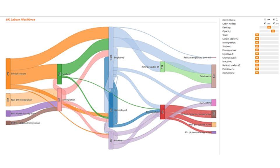
Underpinned by 10 years of workforce data, the team created an interactive tool which provides an insight into the various flows in the labor market.
The tool allows the user to track the movements of the workforce across education, employment, unemployment and retirement over the past 10 years. For example, users can visually draw critical changes in workforce transformation for a specific section of the UK.
What is truly novel about this work is the translation of large amounts of data into a seemingly simplistic Sankey Diagram. Programmed by the student team, the diagram provides the ability to sort complex amounts of data by filtering through 28 spreadsheets of data.
This research was undertaken through the 2016 Data Spark scheme and was created as part of the launch of a sponsor’s workforce transformation proposition to market.
Research team:
Professor Jonathan Haskel (academic mentor), Ying Zhou (MSc Business Analytics), Aamir Khan (MSc Business Analytics), Hoa Giang (MSc Business Analytics), Han Mao (MSc Business Analytics), Stephen Mathers (FT MBA)
