PowerPoint slide presentations are a very popular medium for communicating information in a teaching environment and in meetings. It is important that these slide decks are developed in an accessible way to ensure that everyone can benefit from them. This guide gives you some top tips on how to create accessible PowerPoint presentations.
Use Imperial's branded templates
If you are creating presentations for Imperial business then you must ensure you always use the latest Imperial PowerPoint templates. These templates have been designed to meet the Imperial's branding guidelines in terms of logo use, colour palette and fonts. The templates also use recommended font sizes for the various heading styles, and background colours in order to meet accessibility standards.
The templates also feature a number of different layouts for different types of slide content.
Download Imperial branded PowerPoint templates form the brand management platform
Create accessible PowerPoint presentations that benefit all students
This resource explains how to create accessible PowerPoint presentations for use in lectures and sharing electronically, so benefiting all students, not just those with identified needs.
Making text and structure accessible
- To ensure text is visible to all students in a lecture theatre, use a sans-serif font (e.g. Arial, Verdana or Imperial Sans) in 20-28 point size for main text and 30-44 point size for headings (note some font sizes appear bigger than others). Avoid italics, which can be difficult to read.
- Minimise the amount of text on each slide and keep the layout simple (using bullet points, for instance). If you find yourself putting a lot of text on a slide, then provide this as a separate file instead.
- Use the layout options in PowerPoint rather than adding text boxes to a blank slide as this ensures screen readers can recognise titles. Give each slide a different title and number so students can navigate using assistive technology.
- When linking to other resources, avoid using the phrase ‘Click here’. Instead, give hyperlinks descriptive text such as ‘Find resources by searching the Imperial Library services. This allows students using assistive technology such as screen readers to follow the link.
- Ensure that there is a strong contrast between text and background, for example, dark text on a pastel or cream background (not white). Try to avoid contrasting red and green as these colours can be difficult for those with colour blindness to differentiate.
- Ensure that colours are not the only means of conveying information: use headings to help students distinguish between content.
Sharing slides in advance of teaching
Make slides available online 24 hours in advance of teaching, as well as at the start of the presentation or lecture. This allows time for students using assistive technologies to access materials and will give all students the opportunity to prepare. Sharing documents in advance, including glossaries of new terms or acronyms, is particularly helpful for those with disabilities (e.g. dyslexia) or those whose first language is not English. It may be vital for a deaf student to receive lists of new words before the lecture so they can work out a sign for those words with the interpreter.
Making images accessible, writing alternative text
Adding descriptions to images or charts using the ‘alternative text’ feature ensures the information you want to convey is available to all students, including those using screen readers. To add ‘Alt text’, right click on the image and select "Edit Alt Text...". Now you can provide a short description of the image if the image is there to convey meaning. Alternatively, you can tick the checkbox "Mark as decorative" if the image is for aesthetic purposes only.
Remember
- The same image can have different alternative text depending on the context it is used. Look at this example from WebAIM tutorial about context.
- As the author of the content, you should decide how best to describe the image, making sure a person who is unable to see the image can still extract the message conveyed by the image.
Do
- Provide text in an image as alternative text - for example, if it is a banner over an image give the banner text as alternative text.
- Use concise language to describe the meaning of the image
- As a rule of thumb try to use maximum of two sentences in the alternative text. If the image cannot be described this way, for example it is a complex image such as a graph or chart, describe the image using paragraph text in the document.
Do not
- Do not say "image of". This is unnecessary because the assistive technology will indicate that it is an image. However, if it is important to indicate that it is a handwritten note or a screenshot or similar you can provide this information.
- Similarly, if the image is used as a link, do not say "link" in the alternative text description because the assistive technology will inform the user that the image is used as a link.
And follow these points:
- A short sentence describing the image is likely to be sufficient. Try to identify the key information that the image is intended to convey to students. In charts and graphs, this is often the data. If interpretation of the image is subjective or intended to teach a visual discretion skill, think carefully about which information you should include.
- If possible, avoid using terms that describe visual concepts such as ‘foreground’ or ‘background’.
- If the image is purely decorative, add ‘decorative’ to the ‘Alt text’ field.
Displaying data accessibly
Try to avoid using tables simply for formatting purposes. If you do need to display data in a tabular format, use the table function rather than formatting using the space bar. This will allow assistive technology to recognise the format. If you decide to use a table:
- Try to keep the table as simple as possible (avoid splitting or merging cells)
- Use column headings (found in ‘Table Tools’) to indicate which information is needed to interpret the cells in the table
- Keep table headings short and specific
Using audio-visual content
- Ensure that videos or audio content are accessible to all by enabling subtitles for recorded videos and audio content and/or providing a transcript. Further guidelines on using videos in PowerPoint are available.
- View the recommended Imperial PowerPoint templates.
- Check the accessibility of your presentation using the Accessibility Checker. More details can be found via Microsoft Office’s Rules for the Accessibility Checker.
Top tip: checking and changing the reading order on a slide
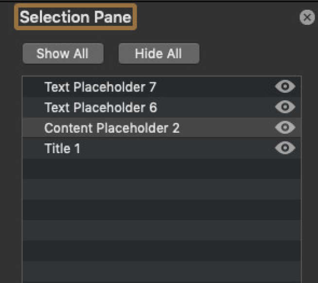
Once you have created your slides it is good practice to check the reading order (also known as z-order) of the content. This will determine the order in which a screen reader reads your content. It is essential to get this right to ensure that screen reader users can understand your content.
If you have used proper slide layouts then it should mean that the reading order is correct, but is still worth checking.
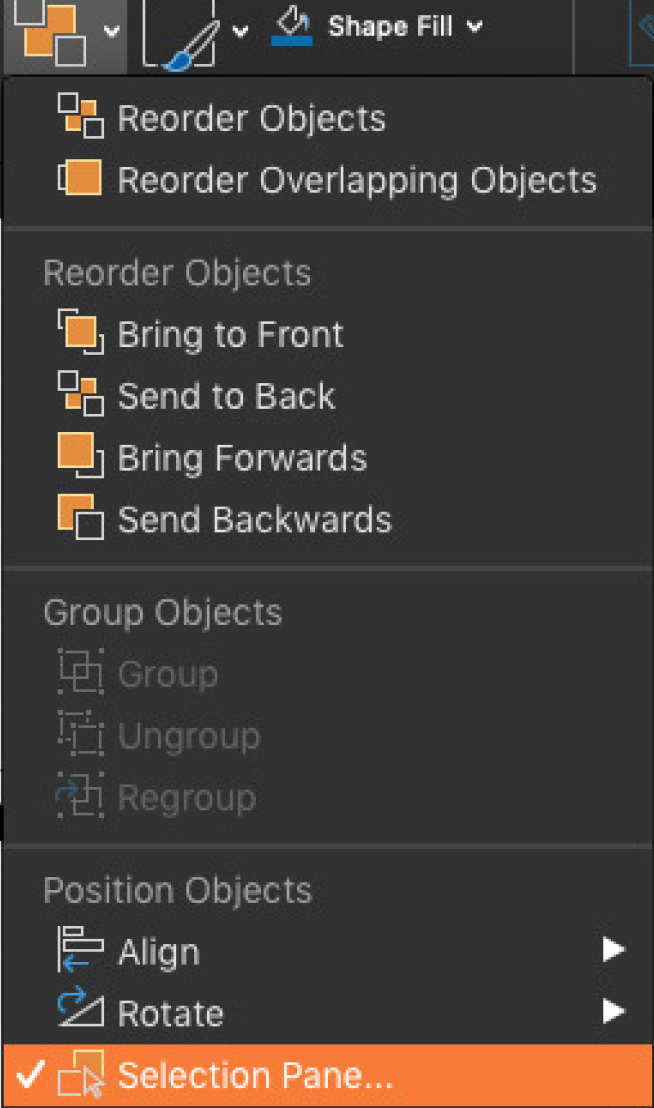
- Click on Arrange on your Home tab.
- Select Selection Pane.
You will then see the order in which a screen reader would read the content. It reads from the bottom of the list upwards. You can move items by simply clicking on them and dragging to the correct position.

