The platform and templates you use to create a survey may be designed to comply with accessibility regulations, but you must still ensure that the structure and content of your survey is accessible, inclusive and effective. A well-designed survey will be easier for all respondents to complete, whether they have a disability or not.
Survey structure
- Use an introduction section to give your survey a clear structure and to provide helpful information at the start of the survey.
- Provide an indication of how long the survey will take to complete at the beginning of your survey and use a progress bar at the bottom of the survey.
- Make sure that questions and answer options are clear and unambiguous. Numbering your questions will help users now that they are following the right sequence.
Language and text
- Use short sentences – this helps everyone to ascertain the questions efficiently, even if they are using a screen reader.
- Keep questions simple and to the point - make your questions easy to understand by using simple everyday language that your respondent will understand. (However, if you are collecting data from expert it is OK to use Jargon that they will understand, as long as you explain the jargon in the first instance.)
- You may be tempted to format text in italic or bold for emphasis – only use this for individual words and not for whole sentences as it makes text harder to read.
- Avoid using BLOCK CAPITALS - the use of All Caps can reduce the readability of your text and reduces reading speed. Find out more about reading speed.
- Avoid changing the font, font colour and font size of your question text. If you must do this it should be used sparingly, as deviating from the templates default may cause problems for users with visual impairments. A recommended minimum font size is 12 pt. The font style is Arial and should be black on a white background.
- If you need to present a large amount of text in a question, break it up into a bulleted list.
- If you use headings within the survey text, ensure they are accessible. Read how to write effective headings.
- If you are using links within the survey text, ensure they are accessible. Read writing descriptive links.
Question layout
It is early important to consider the way a question is laid out to ensure that all users can respond to the question easily.
Some questions layouts are not accessible and should be avoided. You can see a list of Qualtrics questions that are not currently accessible on their website.
Below are some common layouts that can be used and some advice on when to use them.
Multiple choice questions
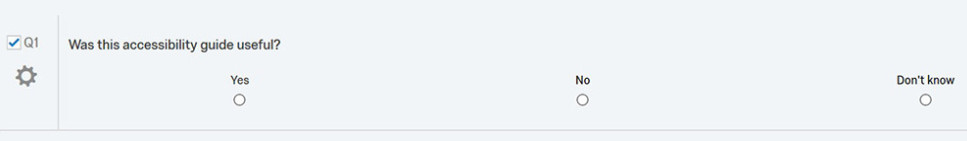
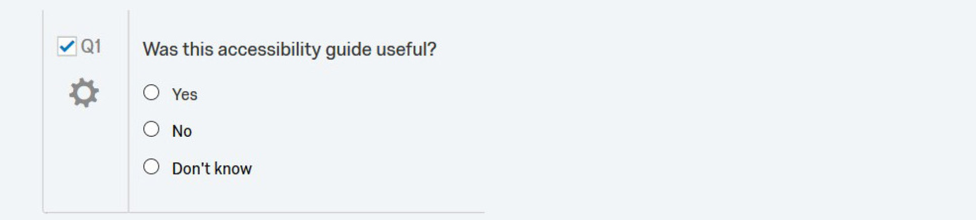
You can choose to present multiple-choice answer options horizontally or vertically. For a simple ‘yes/no’ question, a horizontal format might work well. However, if you offer several possible answer options, it’s often easier for respondents with a visual impairment to read the different options if they are arranged vertically.
Example of a horizontal multiple-choice question. This is not recommended:
Example of a vertical multiple-choice question. This is recommended.
Scales
If you are using a numeric scale which is only defined in the question text then a user with a short-term memory impairment may not be able to remember what the options relate to. They will have to keep referring to the scale for each question.
This is a bad example of a scale question:

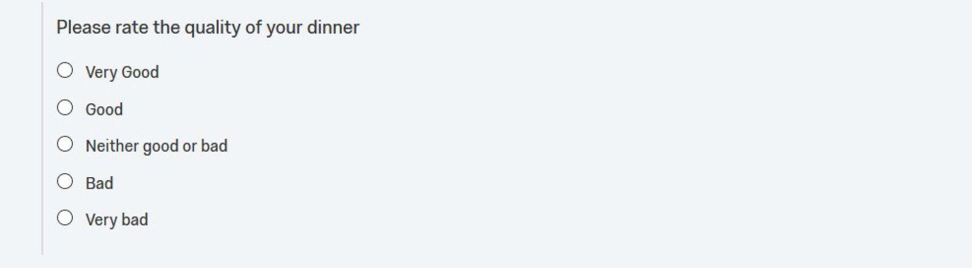
It is better to avoid using a separate scale. Instead use explicit wording for each answer. For example: Very good, good, Neither good or bad, bad, very bad. The user would then be reminded of the possible responses separately for each question:
Question grids
Grid questions or scale/rank questions are often used to group similar questions together with the intention of avoiding repetition and allowing respondents to progress through the survey quickly. For example:
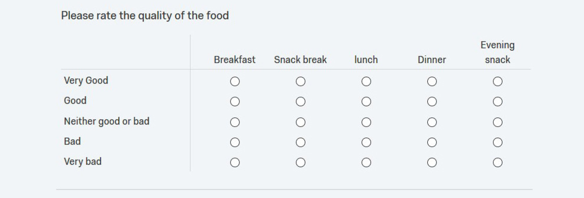
But Grids can result in long, complicated layouts and may not be optimised for mobile devices. This means grids can pose significant barriers both for all users.
To make your survey as accessible as possible, we recommend minimising or avoiding the use of grid and scale/rank questions. If you do have to use this type of question, ensure the vertical and horizontal questions/answers are kept to a minimum.
Images, audio and video
When using images, audio and video in surveys, you should provide a text equivalent for this content. When inserting an image you will be prompted to enter alternative text in the dialogue box.
Find out about accessible images.
For other media (audio or video) you should include a separate transcript or caption in the associated note or question text.
Find out about accessible videos.
Publishing an accessible survey
Creating accessible online surveys is easy as many accessibility considerations are already included by default in the Colleges supported platforms templates and themes.
Many platforms have built in accessibility checkers. For example, the College’s survey tool, Qualtrics has a Check survey accessibility tool that you can use prior to launching your survey which helps indicate which questions are inaccessible, and gives other recommendations for increased accessibility.
Ultimately, you are responsible for verifying the accessibility of your own survey so it is still important for you to examine your survey from your respondents’ perspective. You should always test or pilot your survey with as many users as possible.
Authors can perform some tests themselves (e.g. checking that the survey can be completed using only a keyboard) but the best way to make sure your survey works with particular user groups is for representatives of those groups to test it. Testing will also identify any problems with the language used in the survey.
Further help
- Get more top tips on Writing effective surveys.
- Instructions on using Qualtrics survey tool.
- Quatlrics question type accessibility.
- Qualtrics accessibility features.
- Qualtrics accessibility statement.
Contact us
- Contact your Faculty Web Officer if you have any questions about building surveys.
- Contact the accessibility team if you have questions about accessibility and read our guidance on content accessibility.